Publishing notes · 6 minute read
Why variety matters in an adult coloring collection
A recognizable style should hold a collection together. It should not make every page look as though it came from the same template.
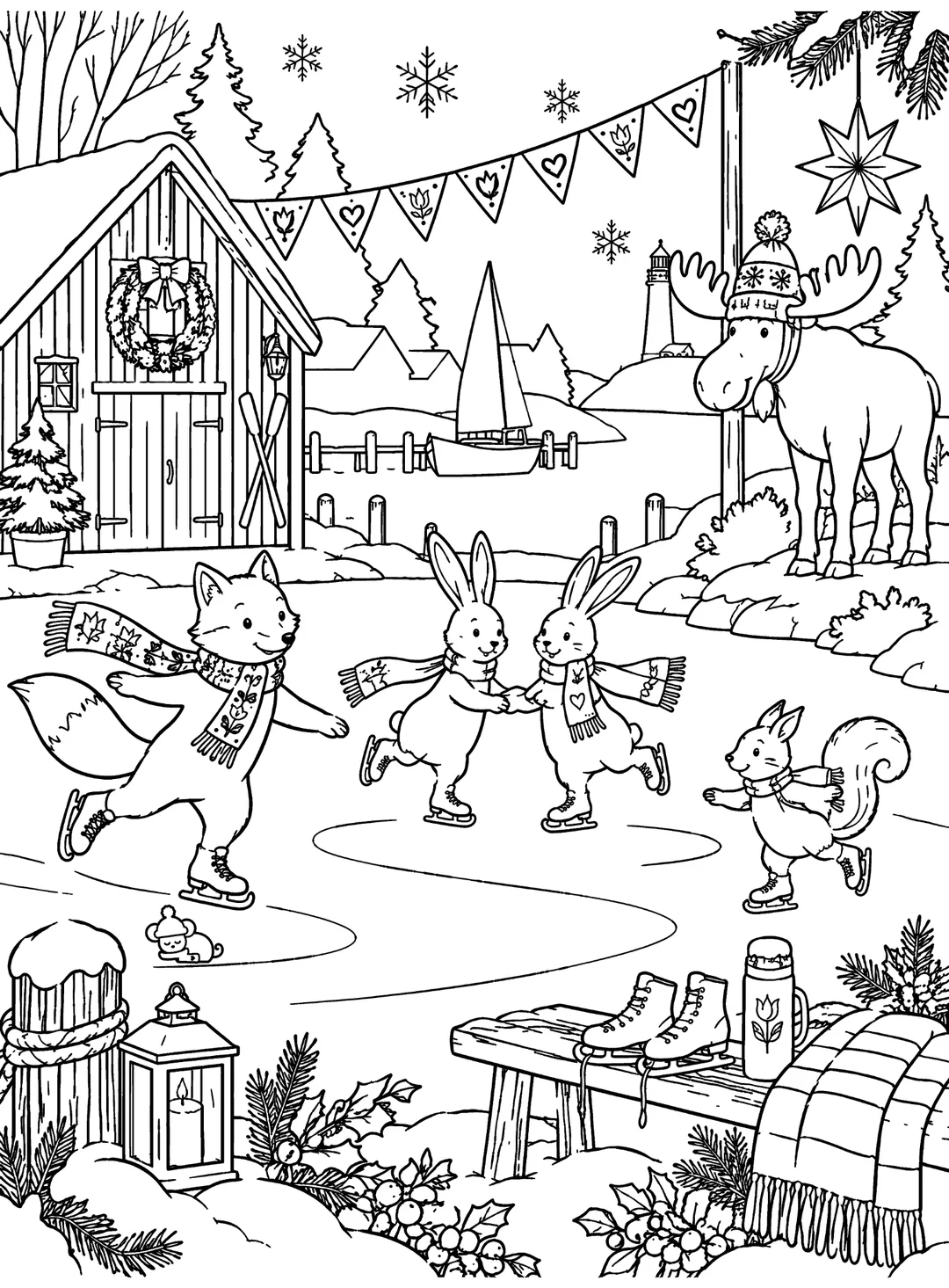
Repetition can be reassuring, until it becomes predictable
When readers open a new coloring collection, consistency is part of the appeal. They want line work, themes and characters that feel as though they belong together. The difficulty begins when consistency is mistaken for sameness: identical borders, repeated poses or the same centered animal with a different accessory.
A series can remain visually recognizable while each page changes what the colorer notices and does. The recurring small mouse Lingon provides one kind of continuity in Whimsy Harbor. The scenes around that little search can still change dramatically.
Change the setting
A winter harbor offers more than one room and one street. A scene by the dock lets water, snow, sky and distant cottages share the picture. A reading nook uses fabric, furniture, firelight and smaller enclosed shapes. A market stall brings decorative ornaments and objects close to the viewer.
Each setting gives the colorer a different set of materials to imagine. The design task is not to fill a checklist but to arrange those settings so the next turn of the page brings a different kind of interest.
Change the scale and density
A broad outdoor illustration might allow a pale sky and larger snowbanks to sit beside a few patterned scarves. A tabletop arrangement can invite careful coloring of many small dishes, bows and decorations. A character portrait can keep the face and clothing central while leaving the background simple.
Density is part of the rhythm of a book. If several intricate scenes appear together, an airy page afterwards can feel generous. If many pages are sparse, a rich showcase illustration can create a satisfying change of pace.
Use action and stillness deliberately
Compare rabbits sledding toward the harbor with a sleeping dog near the fire. Both belong to the same winter world, but they imply different moments. Movement creates diagonals, gestures and changing positions. Stillness makes the details of a room, its light and its textures feel important.
Alternating these moods offers readers a choice even within a single theme. A particular evening might call for a simple, quiet page; another might suit a busy celebration.
Give individual motifs a purpose
Stars, hearts, tulips, lanterns and folk-inspired borders can help unify seasonal illustrations. Repeating them with care creates visual continuity. Repeating them mechanically can flatten every setting into the same decorative recipe.
We look for motifs that belong to the subject: a star suspended in a market, a patterned blanket in a cottage, a wreath at a doorway. Those details make the harbor feel consistent without making all the pages interchangeable.
Sequence for discovery, not for a spreadsheet
There is no universal formula for the perfect page order. An editorial sequence is better evaluated by turning pages as a reader would: notice what the eye sees first, whether visual weight changes naturally and whether the next illustration adds something the previous one did not.
Our practical list includes animal portraits, character moments, full scenes, decorative arrangements, hobby scenes, quiet interiors, outdoor landscapes and multi-character gatherings. The mix matters more than hitting an arbitrary count for each type. The goal is a collection that remains inviting after the first few pages.
- Scene changes: interiors, outdoors and object collections
- Scale changes: wide view, portrait and close-up
- Energy changes: action, celebration and quiet
- Detail changes: spacious pages and richly patterned ones