Reader's guide · 6 minute read
How to choose a coloring book from sample pages
The cover catches your eye. The sample pages help you decide whether the experience inside is really your kind of coloring.
First, notice what the cover cannot tell you
A book jacket has a different job from an interior page. The cover can introduce the theme, mood and visual world, but it cannot show the actual experience of filling each outlined region. An illustrated cover may be richly colored while the pages inside are purely black and white.
Before choosing a book, look for clear pictures of actual interiors. A tiny montage can suggest the art direction, but a full-page sample reveals much more: how tight the lines are, how much detail surrounds the subject and whether the background is dense or open.
Match detail to the time you want to spend
Some people enjoy one intricate project over several sessions. Others want to finish a cheerful scene in an evening. Neither preference is better. What matters is choosing pages suited to how you like to color.
Look at the smallest enclosed shapes in a sample. Imagine using your actual tools on them. If you prefer broad markers or quick shading, pay attention to pages with larger regions and more white space. If you enjoy pencil layering and decorative patterns, you may welcome a denser arrangement of objects.
Look for several kinds of page
One attractive sample proves that one illustration is attractive. It does not tell you whether the entire book maintains variety. Ideally, previews show more than one scene type: perhaps an outdoor landscape, a character-centered page and an object-rich interior.
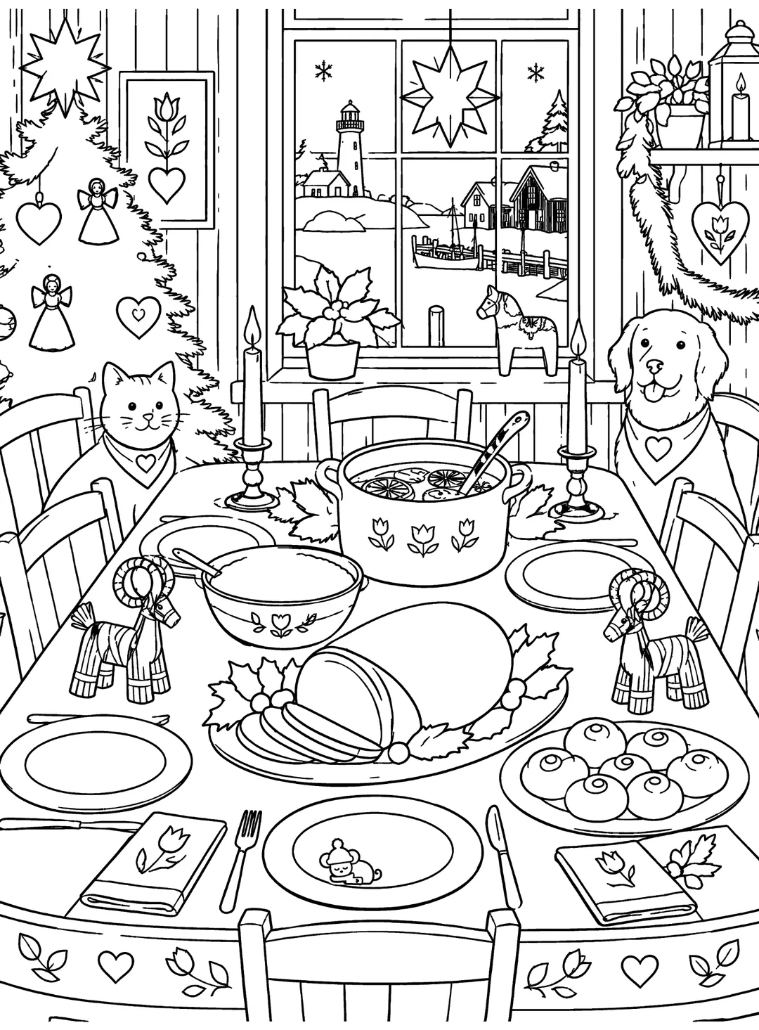
Compare two real Whimsy Harbor samples. The winter skating scene has motion, open snow and multiple animals. The holiday meal arranges food, dishes and decorative objects around a central table. They have a shared visual language, but they invite different choices about color and texture.
Read the product specifications separately
Dimensions, binding, page count and single-sided printing are edition-specific details. Verify them on the actual product listing, not only from a promotional graphic. Different formats of the same title may have different specifications or availability.
Single-sided artwork can be appealing to readers who like to remove or display a finished page, but paper and media behavior depend on the actual edition and the tools used. For markers in particular, a spare sheet behind your work is a sensible precaution. Do not assume that any unspecified printing method makes a page bleed-proof.
Check line clarity rather than just line thinness
Good line art often combines stronger boundaries with finer detail. A page can be beautifully complex and still remain readable if the outlines do not collapse into one another. Try zooming out until the page is roughly the size it might appear in a book preview. The main subject should remain recognizable.
Then inspect an enlarged view for awkward joins, accidental text, strange geometry and ambiguous edges. A clean digital thumbnail can hide problems that become distracting as soon as you start coloring.
Use a sample as a promise of experience
A useful sample lets you picture a calm evening with your pencils or markers, not simply admire someone else's finished color scheme. The best choice is the book whose pages make you want to begin, regardless of which cover is loudest.
We share original black-and-white sample pages from A Whimsy Harbor Christmas Coloring Book so readers can examine the art without relying only on a colored marketing image. The samples are copyrighted illustration previews, not a promise that every page will have identical detail or composition.