At the drawing table · 6 minute read
What makes a coloring page worth keeping?
Beautiful lines alone do not make a beautiful coloring experience. The spaces between them matter just as much.
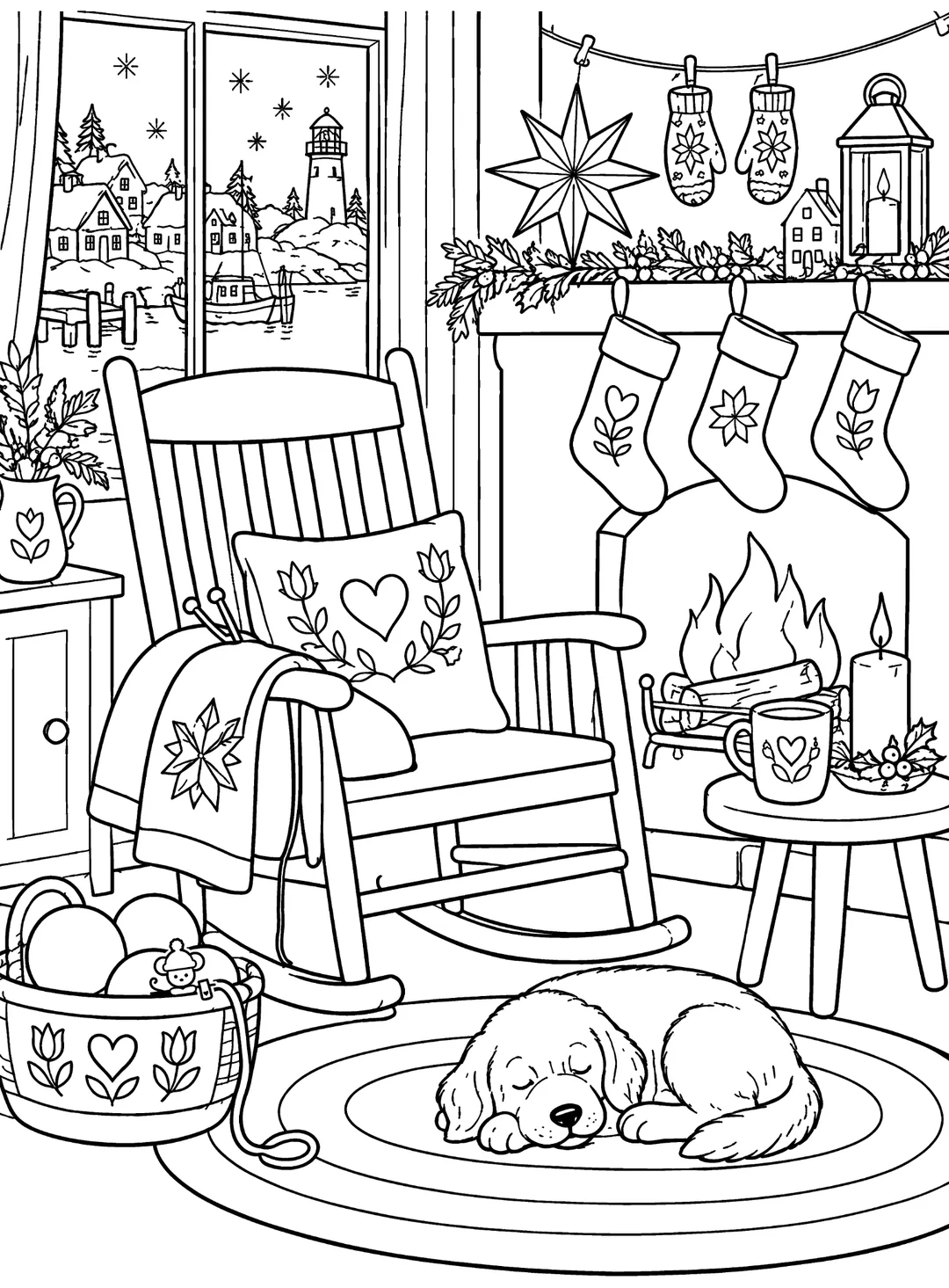
Begin with a scene someone wants to enter
At Greatest Pages Press, the first question about an illustration is not how many details it holds. It is whether the subject is appealing before someone has picked up a pencil. A tiny harbor cottage, a dog asleep beside the fire or a table ready for a holiday meal should communicate a recognizable moment at a glance.
The clear subject gives the eye somewhere to land. Everything around it should support the moment, not compete to become the moment. In the Whimsy Harbor samples, a fireplace can anchor one page while a crowded wrapping table anchors another. Both can work because the composition has a reason to exist.
Make spaces enjoyable, not merely intricate
Adult coloring pages can be richly detailed without forcing every area into the width of a pencil point. A solid outer silhouette makes the subject easy to read; medium-fine interior lines leave space for choices about color, contrast and texture. There is little joy in an elegant-looking page if the regions are so small that they feel impossible to finish.
We look for enclosed regions that can be colored comfortably, large resting areas between busy clusters, and a sensible rhythm of simple and elaborate shapes. The same page may invite a soft wash of color in the background and more deliberate work on a patterned blanket or ornament.
Let white space do some work
The empty parts of a black-and-white illustration are part of the design. A clear windowpane can be as important as the garland hanging beside it. White space can suggest snow, fog or winter light; it can also give the colorer a place to take a break.
Adding another snowflake, flourish or decorative border does not automatically improve a page. We ask whether each addition offers something useful to color or merely occupies an empty spot. A deliberate pause is often a better choice than one more pattern.
Inspect the objects, not only the arrangement
The human eye recognizes a surprising number of small errors. A chair that could not stand, a mug with an impossible handle or an animal with an awkward extra paw can interrupt the whole scene. Decorative art may be whimsical, but its objects still need a coherent visual logic.
For that reason, composition review and detail review are separate jobs. The broad scene has to work when seen small; individual shapes need to make sense when enlarged. We look for cropped subjects, broken lines, unwanted text, confusing intersections and regions that might be difficult to color.
Consider the whole collection
A single strong drawing is not a whole book. If every spread asks for the same effort, readers may notice the repetition before they notice the craft. Our editorial questions include what a page contributes to the neighboring pages: a different setting, a change of scale, a new sort of object or a quiet interval after a busy scene.
The aim is not complexity for its own sake. It is a book that someone can browse with curiosity, begin without hesitation and return to because the next page offers a slightly different pleasure.
The three-question test
Our practical shorthand is simple: Is the subject immediately appealing? Does the page offer enough enjoyable areas to color? Will the reader find a pleasant surprise in the composition? A page does not need to be perfect in one dimension to succeed overall, but it should have a convincing answer to all three.
These are editorial principles, not claims of a scientific scoring system or guarantees about what every colorer prefers. They help turn a promising illustration into a page that earns its place in a book.
- Immediate subject appeal, seen at thumbnail size
- Interesting and usable colorable spaces
- A composition worth discovering while turning pages